
01
The Challenge
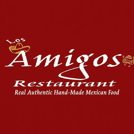
Los Amigos has a strong local reputation, but it's visual identity and digital presence didn't reflect the quality of the food or the experience.
Outdated branding
No Consistant Visual
Menu lacked hierarchy
Old look

02
Design Goals
Preserve the restaurant culture
Modernize the experience
Improve readability
Increase trust & creditabilty
Make ordering & catering easy
03
Understanding the Business
Before opening Adobe Illustrator, I researched how customers interact with local restaurants
How quickly can customers find their dish
What information matter most?
What makes someone trust a restaurant online?
How can the brand feel authentic rather than corperate?
04
Logo Redesign
Old Logo
Skecthes

Final Skecth

Final Logo with Color

The goal was to completely replace the identity but to refine it into a cleaner scable logo for suitable needs like websites, menus, signage, and social media.
05
Menu Design
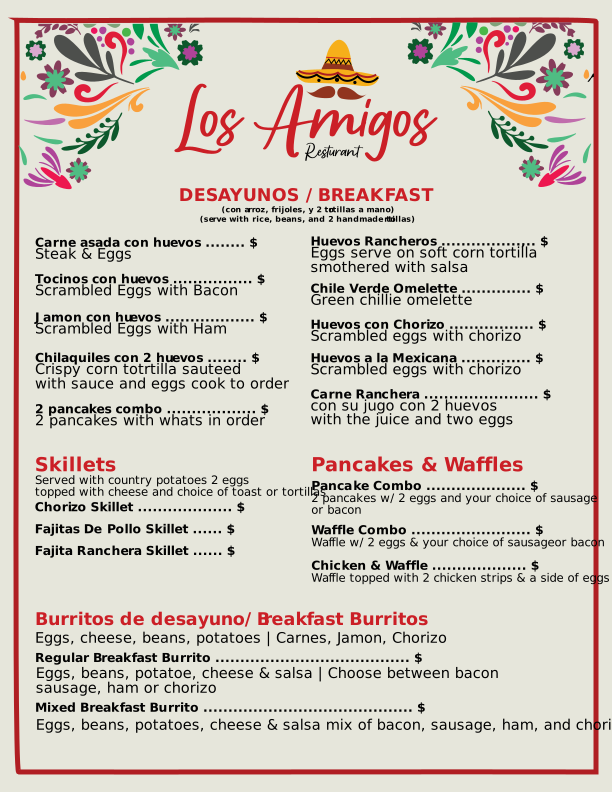
Restaurant menus should facilitate quick decision-making for customers. To achieve this, I redesigned the menu using visual hierarchy to separate categories, enhance readability, and create a more enjoyable browsing experience.


06
Design Theme
A consistant design system ensures the brand feels unifed across every touchpoint.
Colors
#8B0B0C
#FFBA00
#141414
#FCF3E1
Typography
Aa
Poppins
Aa
Anton
UI Elements
Primary Button
Secondary Button
Other
Card
Text Field
07
Responsive Design
Every layout was designed to adapt into other screen sizes while preserving readability and usabilty.
Desktop

Mobile
